
Website redesign case study
From unclear to unstoppable.
From unclear to unstoppable.
How a clearer message, stronger customer journey and better technical foundations transformed the Peak Neuro website.
Project at a glance
Peak Neuro Australia
Peak Neuro Australia
Industry: Neurofeedback system rentals
Work: Website strategy, redesign, landing pages, on-page SEO and technical optimisation
Key result: Technical website health score improved from 87 to 100
The transformation
A complex service made clearer.
A complex service made clearer.
Peak Neuro provides NeurOptimal neurofeedback system rentals across Australia. The service is innovative, but the old website made visitors work too hard to understand what was being offered, how it could help and what they should do next.
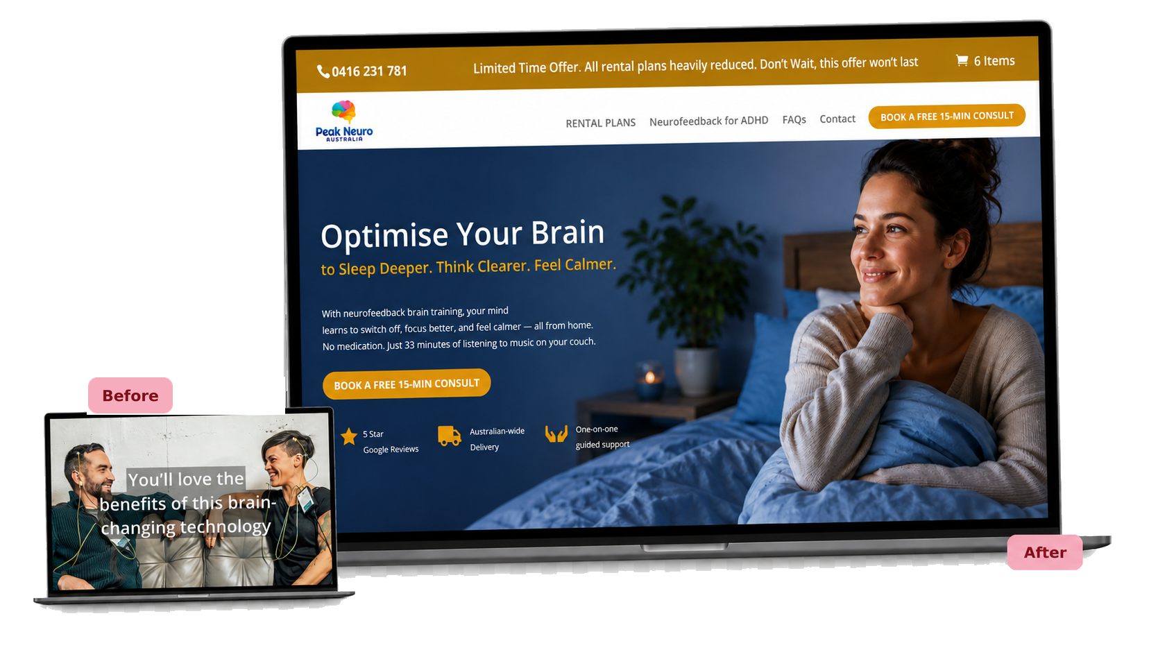
The website needed to explain the service before it could sell it.
The website needed to explain the service before it could sell it.
The previous homepage opened with a confident statement, but it did not immediately explain what Peak Neuro offered.
Someone arriving on the website still had to work out what the technology was, whether it was relevant to them, how the rental service worked, whether support was available and what to do next.
That is a lot to ask of a visitor, particularly when the service is unfamiliar.
The old message
“You’ll love the benefits of this brain-changing technology.”
“You’ll love the benefits of this brain-changing technology.”
Enthusiastic, but not yet clear enough to help a new visitor understand the offer.
The strategy
Clarity before cleverness.
Clarity before cleverness.
The goal was not simply to give the site a more polished appearance. It was to make Peak Neuro easier to understand, easier to navigate and easier to act on.
01. Clarify the offer
01. Clarify the offer
Explain the service from the first screen, using plain language rather than assuming visitors already understand neurofeedback.
02. Create a clear path
02. Create a clear path
Organise the website around rental plans, common questions and the information people need before booking.
03. Build trust
03. Build trust
Bring reviews, delivery information, guided support and the free consultation closer to the main offer.
04. Support campaigns
04. Support campaigns
Create focused landing pages for paid advertising without allowing those pages to compete with the website’s organic search structure.
05. Strengthen the foundations
05. Strengthen the foundations
Resolve technical audit issues and improve the site’s crawl health, structure and on-page SEO foundations.
What changed
Clearer from the first screen.
Clearer from the first screen.
The redesigned homepage now leads with a clear outcome-focused headline and immediately explains that Peak Neuro provides neurofeedback brain training that can be used from home.
A prominent Book a Free 15-Minute Consult button gives visitors one clear next step without asking them to commit to a rental before they are ready.
A simpler rental journey.
A simpler rental journey.
Clear pathways now direct visitors to rental plans, information about neurofeedback, frequently asked questions and consultation options.
Trust signals are placed where they are most useful, including five-star Google reviews, Australia-wide delivery, one-on-one guided support and a free consultation.
Landing pages built for the campaign journey.
Landing pages built for the campaign journey.
Focused landing pages were created for audiences seeking information related to ADHD, PTSD and anxiety.
Each page provides a more relevant entry point for people arriving through Meta advertising and guides them towards a free consultation.
Because the pages were designed specifically for paid campaigns, they were intentionally set to noindex. This supports advertising without creating unnecessary duplication within the organic search structure.
Built for purpose
Relevant page. Clear next step.
Relevant page. Clear next step.
Not every landing page needs to rank in Google. These pages were created to do one job well: support the advertising journey.
Technical website health
87 → 100
87 → 100
Stronger foundations behind the design.
Stronger foundations behind the design.
Alongside the visible redesign, I improved the page structure, internal pathways, indexation settings, on-page SEO foundations and technical crawl health.
Following this work, Peak Neuro’s technical website health score increased from 87 to 100 in the SE Ranking site audit.
This score does not measure enquiries or sales. It confirms that the audited technical issues were resolved and the website’s foundations were strengthened.
The result
A clearer path from curiosity to conversation.
A clearer path from curiosity to conversation.
The old website led with a broad promise but left visitors to work out what Peak Neuro actually offered.
The redesigned website now:
- explains the service more clearly
- gives visitors an obvious next step
- makes rental and support information easier to find
- places trust signals where they are most useful
- supports targeted advertising with focused landing pages
- has stronger technical and SEO foundations
The result is a website that better reflects the business behind it and gives prospective customers a clearer journey.
Does your website make people work too hard?
Does your website make people work too hard?
If your business has grown, changed direction or become more specialised, your website needs to keep up. I can help you clarify your message, organise your content and build a website that makes your business easier to understand and easier to choose.